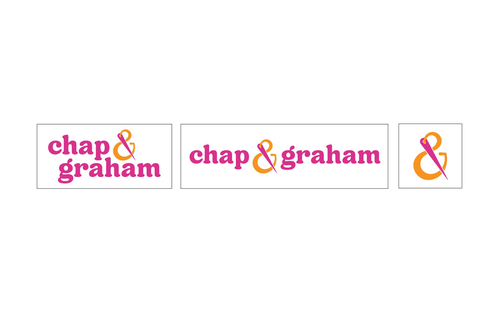
Updated primary logo, horizontal and stacked
Ampersand icon
“Live life in color” badge and tagline variations
Primary and accent color palettes
Typography system
Quick reference brand guidelines
Ongoing full service marketing
The Challenge
[One or two sentences on what Chap & Graham does and why the brand needed an update. For example: the old logo didn’t match the energy of the business, or it didn’t work well on social media and merchandise.]
Our Approach
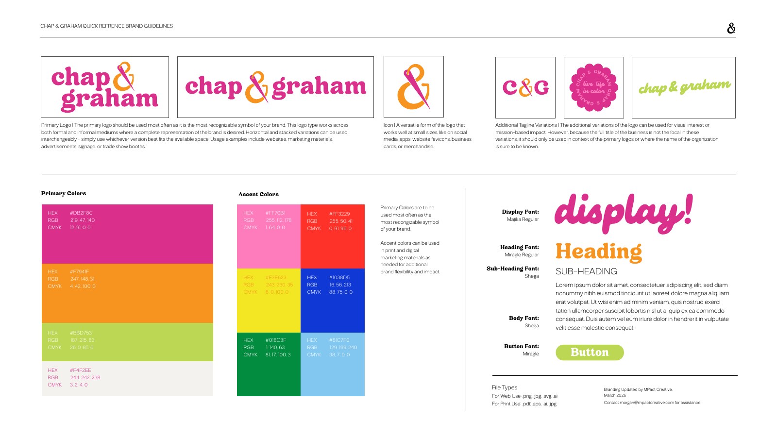
We leaned into personality. The updated logo pairs a rounded, friendly wordmark with an oversized orange ampersand that also works on its own as an icon for social media, favicons and merchandise.
Supporting marks include a C&G monogram, a circular “live life in color” badge and a script tagline lockup. The palette lives up to that tagline: magenta, orange and lime as primary colors, backed by pink, red, yellow, cobalt, green and sky blue accents for extra flexibility. A display, heading and body font pairing keeps everything consistent from signage to the website.
The work didn’t stop at the brand guide. As Chap & Graham’s full service marketing partner, MPact Creative carries the brand into the day-to-day marketing, so every piece looks and sounds like the same bold, colorful business.
The Result
Chap & Graham now has a brand that’s instantly recognizable and easy to use, with a quick-reference guide that puts every logo, color and font in one place for web and print.
The orange ampersand has become an iconic, instantly recognizable mark for Chap & Graham, and full service marketing keeps it consistent everywhere customers see it.
Our most complete brand identity project: a full brand system for a national health science education nonprofit, from a refreshed logo to brand guidelines and a reveal video.