Our most complete brand identity project: a full brand system for a national health science education nonprofit, from a refreshed logo to brand guidelines and a reveal video.
Refreshed primary logo
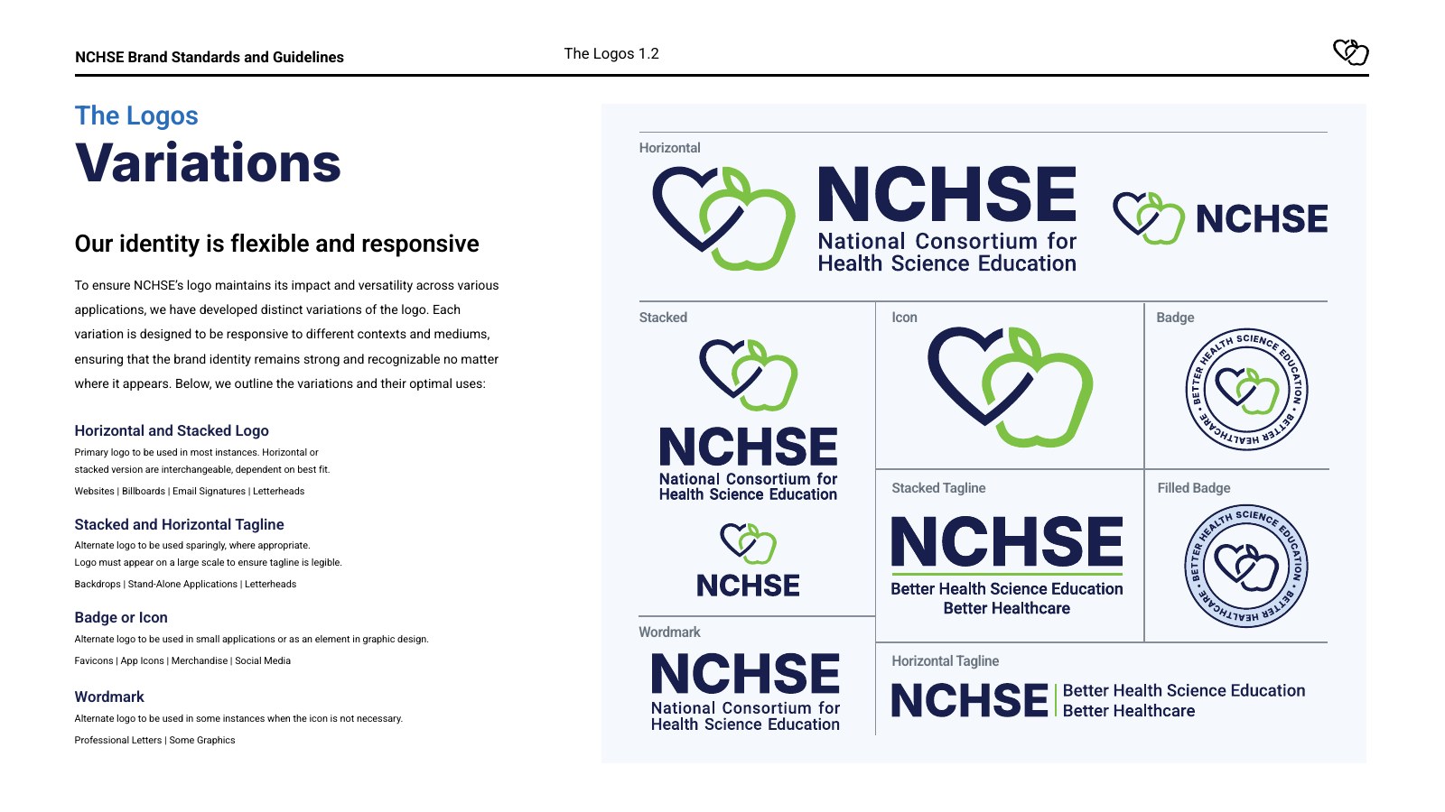
Horizontal, stacked, tagline and wordmark variations
Icon and badge marks
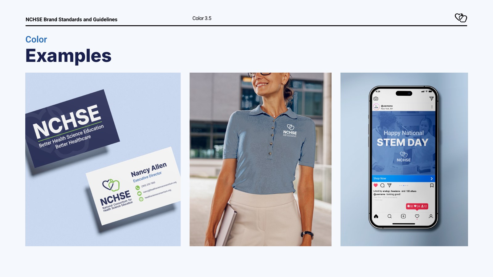
Color palette with print (Pantone/CMYK) and digital values
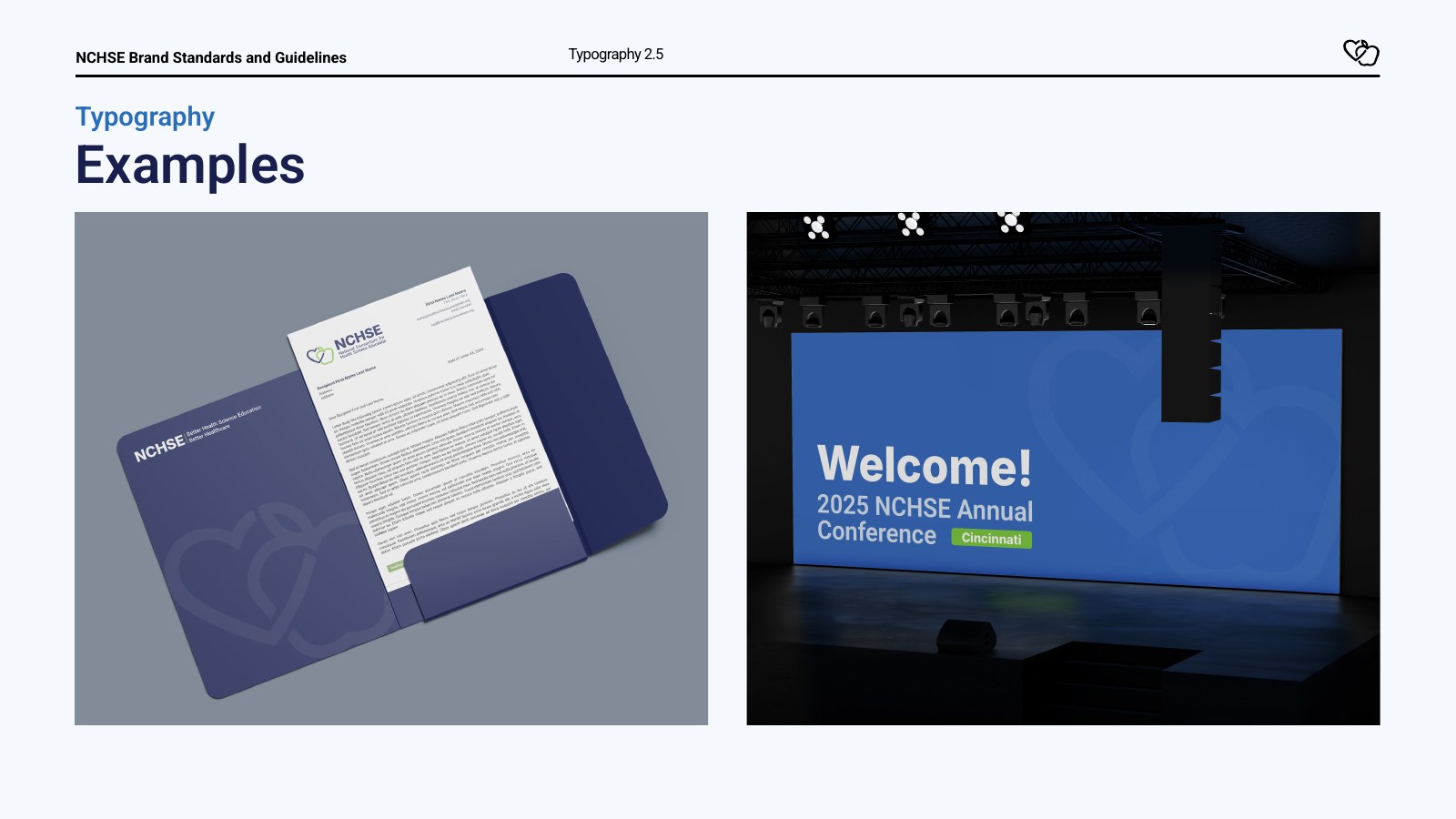
Typography system (Inter and Roboto)
24-page brand standards guide
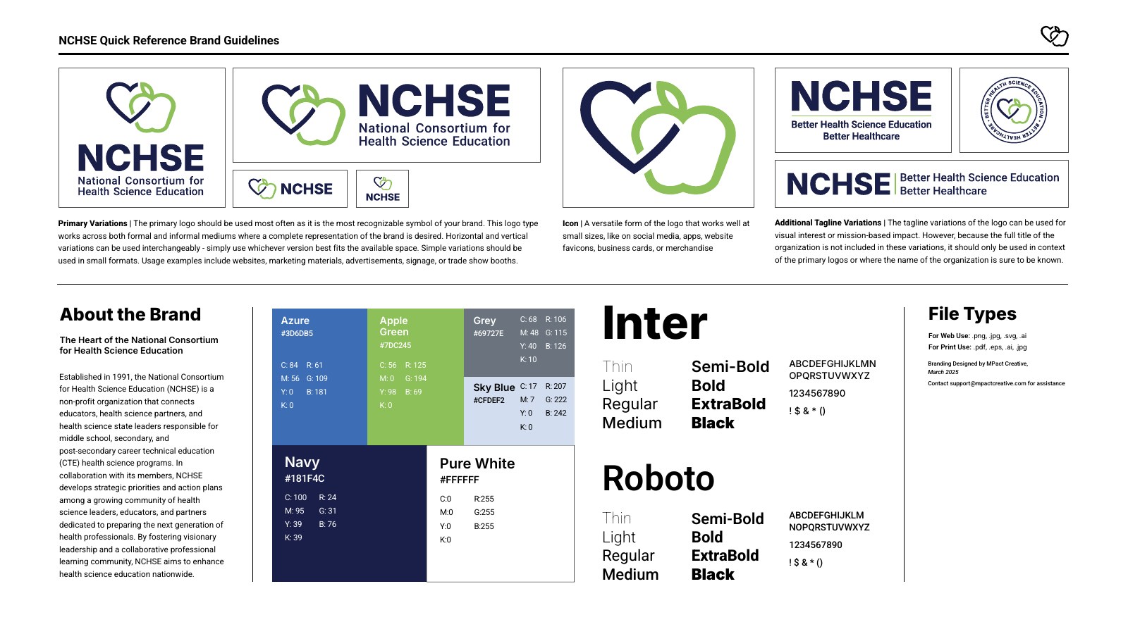
One-page quick reference guide
Brand reveal video
The Challenge
Since 1991, NCHSE has connected health science educators, state leaders and industry partners across the country. Its interlocking heart-and-apple mark carried decades of meaning, but the partial-outline drawing was hard to read at a glance, and the brand had no clear rules for how it should be used.
NCHSE needed a refreshed identity that kept that symbolism and gave members, staff and partners a consistent way to present the organization.
Our Approach
We kept the heart and apple and finished both shapes. Enclosing the apple leaf completes the outline, so the two shapes balance each other and read clearly at any size. The woven emblems still stand for the partnerships NCHSE builds between educators, state leaders, professionals and students.
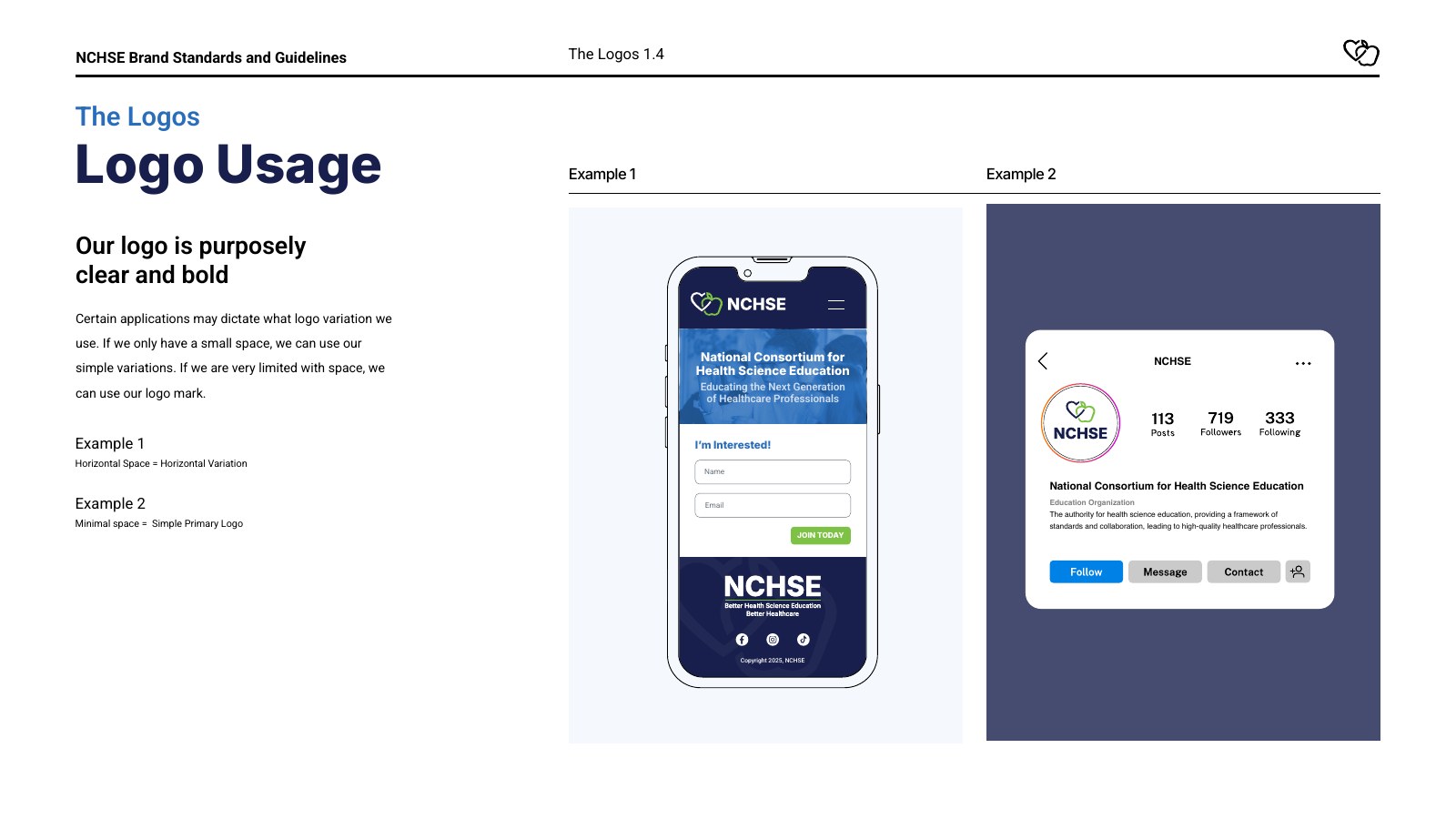
From there we built a flexible system: horizontal and stacked logos for everyday use, tagline lockups for large formats, and an icon and badge for favicons, social media and merchandise. A navy, azure and apple green palette and the Inter and Roboto type families tie it together across print and screen.
The Result
NCHSE launched its new look with a brand reveal video and a complete 24-page brand standards guide covering logo usage, color, typography and file types, plus a one-page quick reference for everyday use. Staff and partners now have one source of truth for every application, from conference screens to business cards.