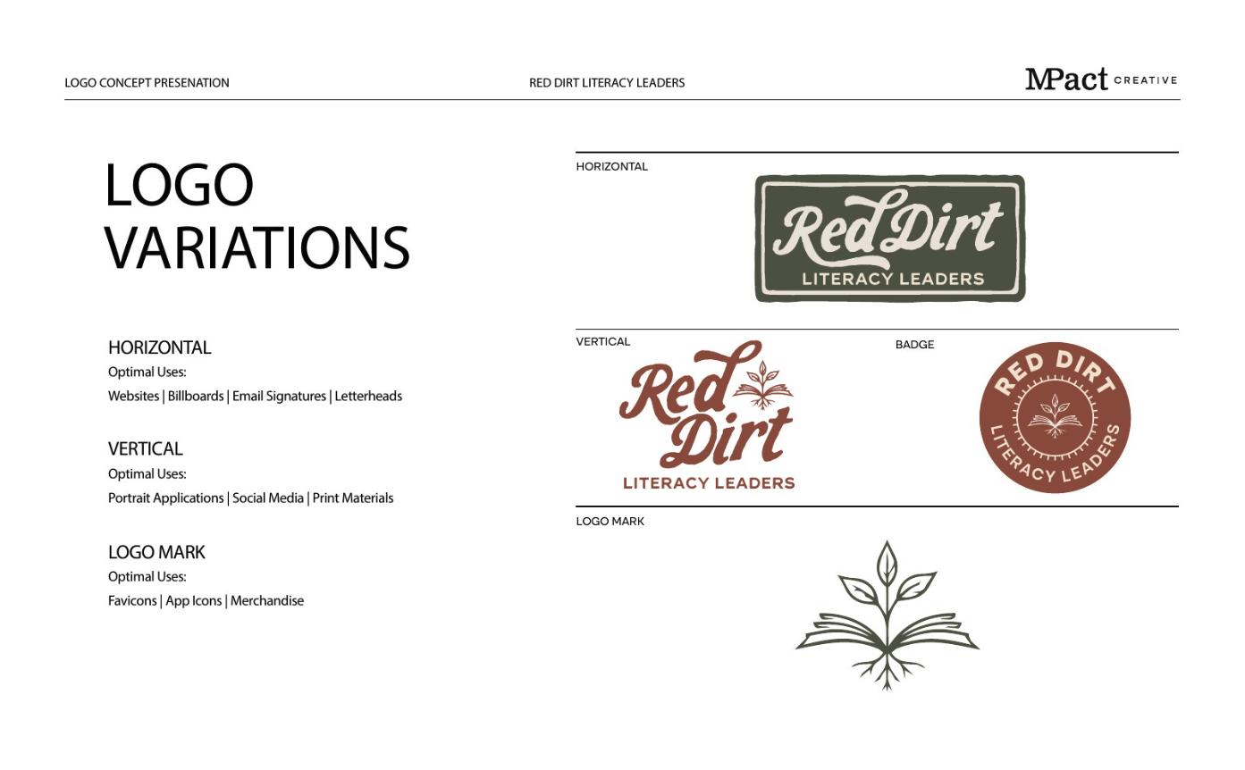
Primary logo, horizontal and vertical
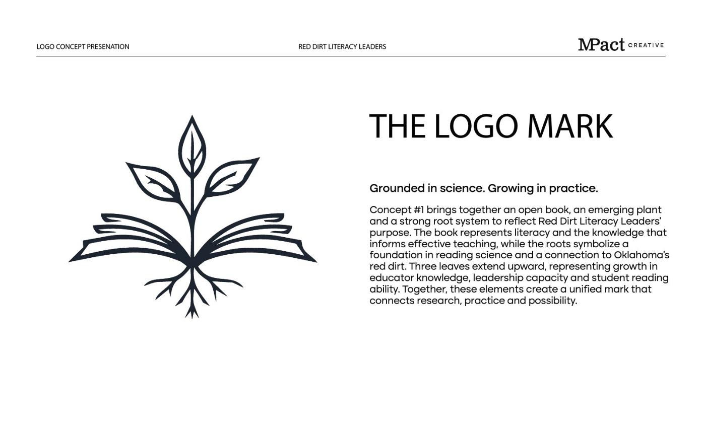
Book-and-seedling logo mark
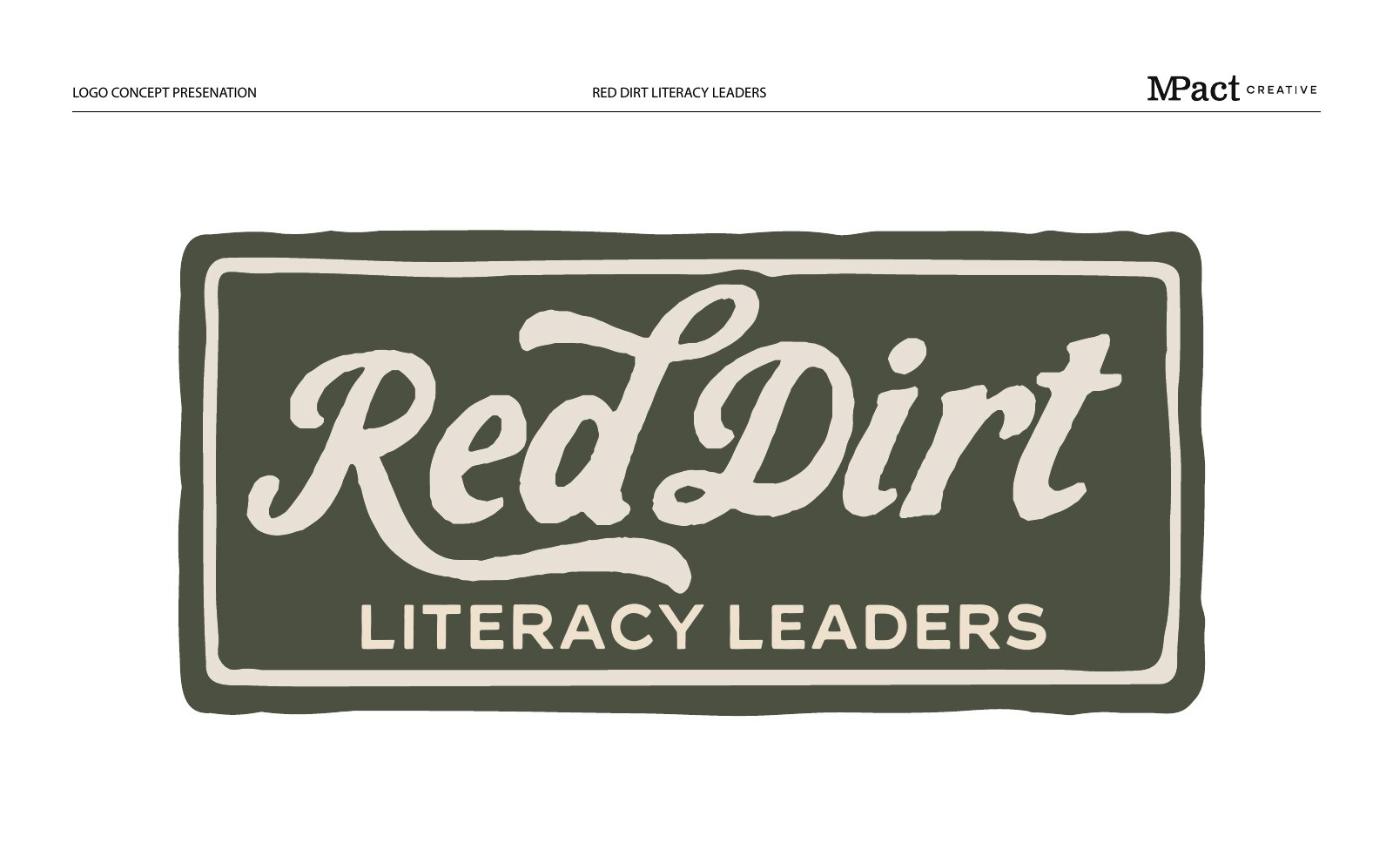
Horizontal and circular badge variations
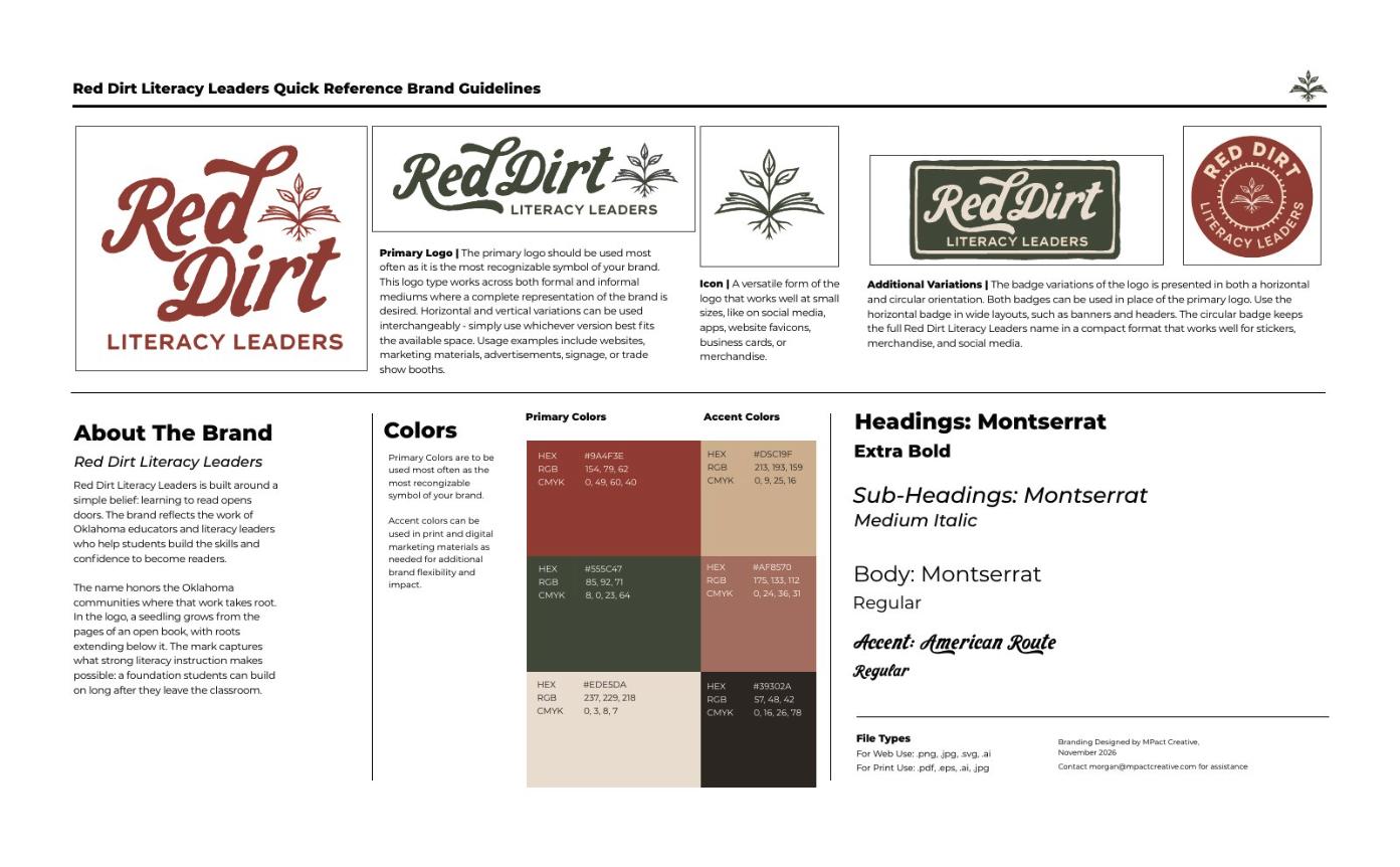
Primary and accent color palettes
Typography system
Quick reference brand guidelines
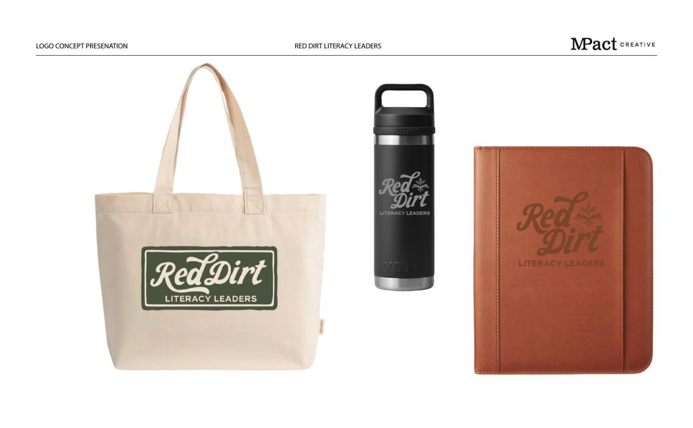
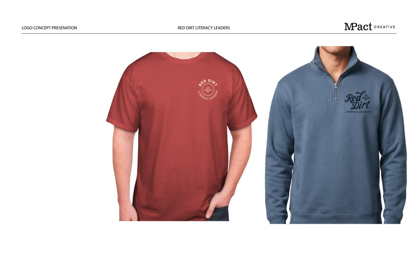
Merchandise and apparel mockups
The Challenge
Red Dirt Literacy Leaders equips Oklahoma educators and school leaders with the knowledge, confidence and leadership skills to put the science of reading into practice. The organization needed a brand that felt credible to educators and grounded in research, while still feeling warm, approachable and unmistakably Oklahoman.
Our Approach
We began with a logo concept presentation that covered the organization’s values, competitor identities and a design direction inspired by Oklahoma’s red dirt landscape. The final logo mark brings together an open book, an emerging plant and a strong root system. The book represents literacy and the knowledge behind effective teaching, the roots stand for a foundation in reading science and a connection to Oklahoma’s red dirt, and three leaves represent growth in educator knowledge, leadership and student reading ability.
A flowing, vintage-inspired script pairs with clean Montserrat lettering, and an earthy palette of clay red, olive green and warm neutrals reflects the name. Horizontal and circular badges give the brand flexible options for banners, stickers, apparel and social media.
The Result
Red Dirt Literacy Leaders now has a complete, flexible identity that reflects its message: grounded in science, growing in practice. A one-page quick reference guide keeps the logo, colors and fonts consistent across events, merchandise, presentations and digital marketing.
A cheerful, colorful brand for the Oklahoma Department of Agriculture, Food and Forestry’s Farm to School Program, plus a statewide school garden guide.