Brand identity and logo system
Icon and tagline variations
Color palette and typography
Quick reference brand guidelines
Custom WordPress website
Policy priorities page
Email newsletter signup
Contact page
The Challenge
Oklahoma consistently ranks near the bottom nationally in key health outcomes. SHIFT OK (Shaping Healthier Initiatives for Tomorrow) works to change that through data-informed policy education, advocacy and reform, and it needed a brand and a website that would make its case clearly and grow its audience.
Our Approach
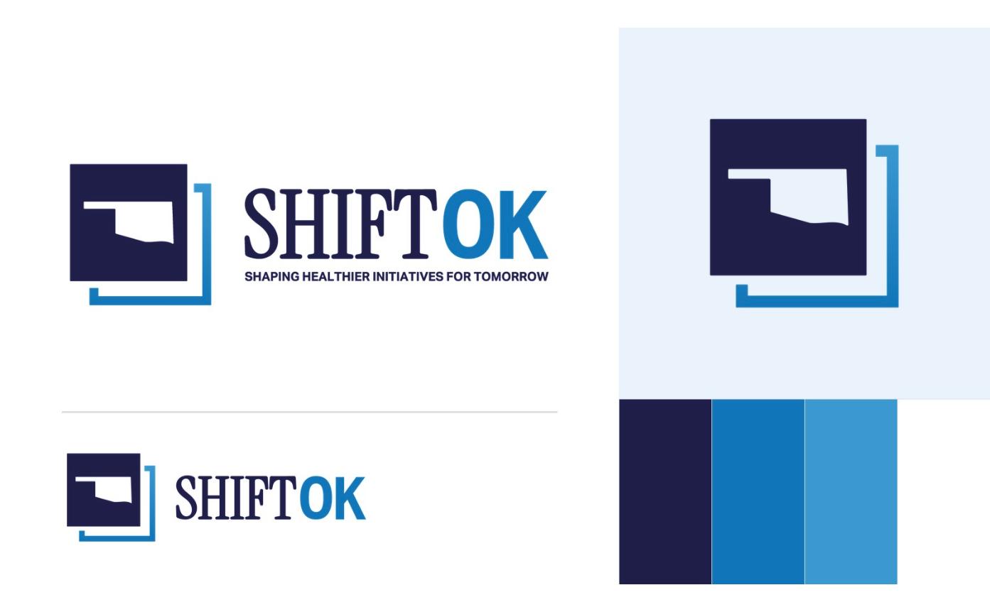
We started with the brand. After a mood board presentation with two creative directions, SHIFT OK chose a clean, policy-forward look. The logo places the shape of Oklahoma inside a navy square, with an offset blue frame that suggests movement and change. A classic serif “SHIFT” pairs with a bold “OK,” and a tagline lockup spells out the name: Shaping Healthier Initiatives for Tomorrow.
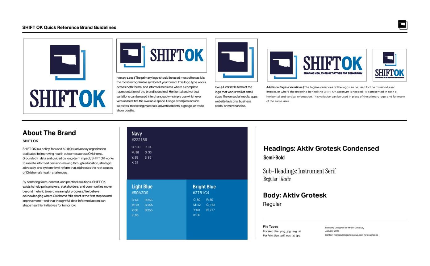
The palette of navy, bright blue and light blue feels trustworthy and rooted in health care, and a quick reference guide keeps the logo, colors and fonts consistent everywhere the brand appears.
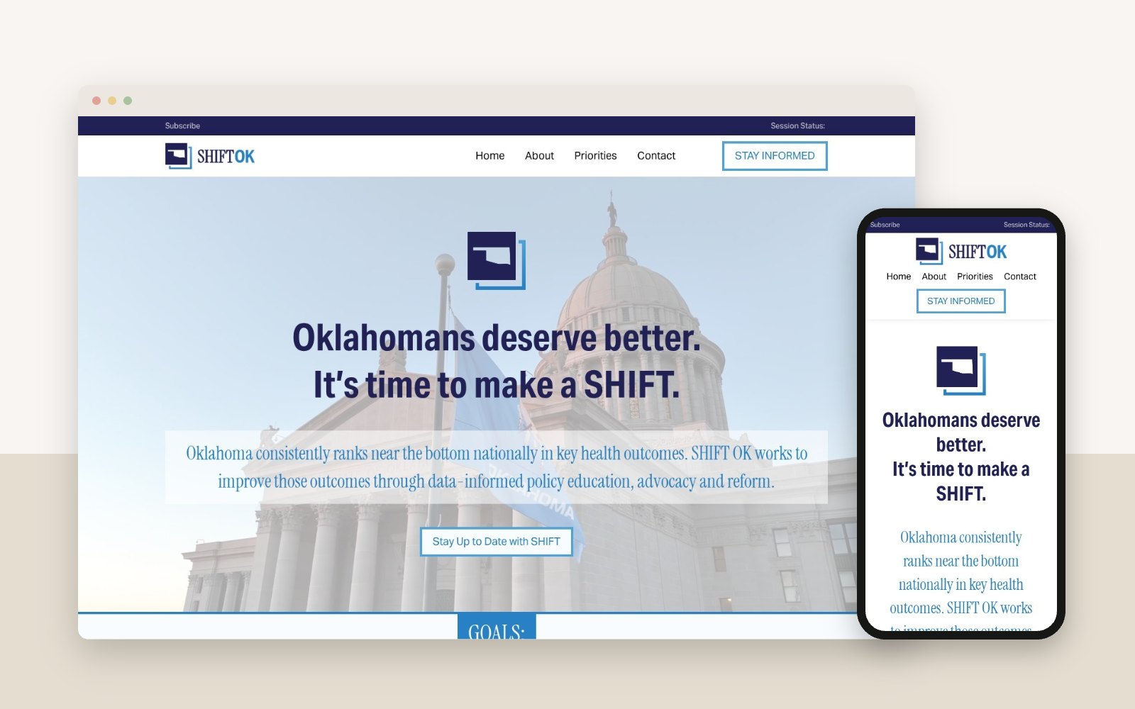
The homepage leads with a direct message, “Oklahomans deserve better. It’s time to make a SHIFT,” and then breaks the organization’s work into three goals: access to care, a healthy workforce and cost-effective policy.
Newsletter signups appear throughout the site, so visitors who want policy updates and issue briefs can subscribe from almost anywhere.
The Result
SHIFT OK has a focused, credible platform to share its priorities and build a list of Oklahomans who want to stay informed.